
.jpg)
My role on this project was Product Designer. I was sole designer on the team. I was involved in the project from discovery through launch taking part in research and driving the design process for the entire app. I was responsible for creating the user experience choices, user Interface designs, user interactions, and prototypes. I also created all of the illustrations.
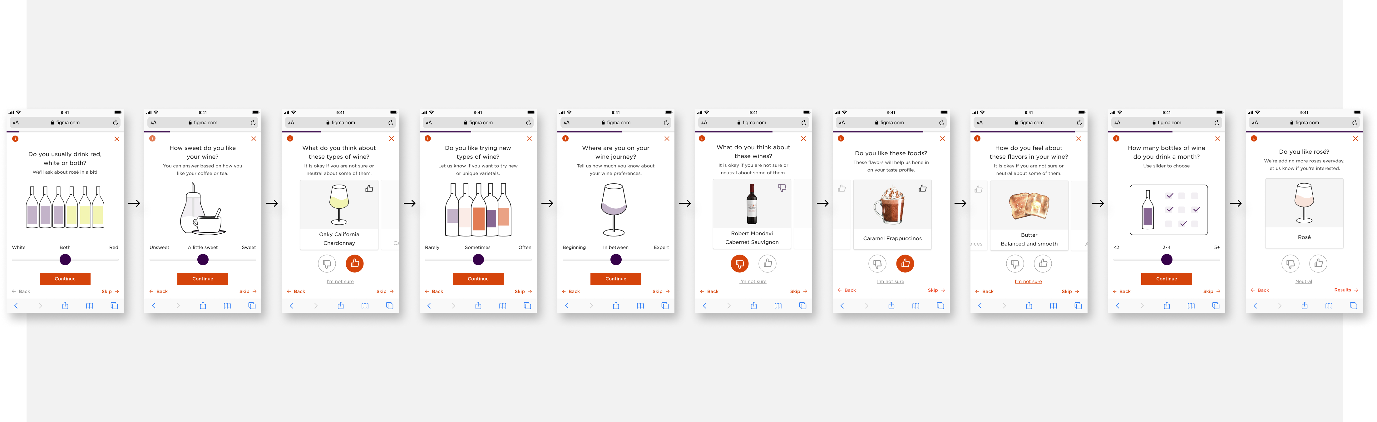
Our small scrappy team, made up of a product manager, a frontend developer, a backend developer, and a designer (me) set out to create a wine recommendation app using Firstleaf’s algorithm that chemically analyzes and selects wine for club members based on their wine preferences.
The first step for the app team was to prove the algorithm could work on a larger scale by accurately generating a numeric percentage of how confident it was that the user would like the wine based on their ratings. Internally we called this the confidence score.
Behind the scenes the data science and wine teams were working with us to chemically analyze wines, produce confidence scores, and create algorithm generated tasting notes on a 1 to 5 scale. Up to this point Firstleaf’s tasting notes were created manually and involved multiple people tasting each wine. We knew this would need to change in order to scale up to include the tens of thousands of wines outside of the club.
Our team focused on four core pieces of the apps functionality, login and account creation, search, wine confidence score, and the ability to rate a wine.
Since the first version of the app was going to be internal, and we wanted to move fast, I decided to keep things simple and design using as many components as possible from Firstleaf’s existing design components.
We needed to put all the parts together quickly and prove it could work.

The login experience allowed the user to create an account and then use that account to log back into the app if they had been logged out during an update.
The autocomplete search functionality allowed the user to search by wine name, region, varital, vintage, and wine type.
After users rated six wines we able to use the information collected from the algorithm to display an accurate confidence score for each wine that we had a chemical analysis on.
Users were able to rate wines with a "thumbs up" or "thumbs down'. Those ratings would be used to improve their confidence score.
Feeding all of the manual tasting data and wine analysis information into the algorithm allowed it to create consistent wine tasting notes that matched our wine tasters in the 90 percentile range.
After users rated six wines we could produce an accurate confidence score for each wine that we had information for.
After all the parts were put together we had created the core of the app and had proven that it could scale.
After creating the functionality to find wine, show results, and proving the algorithm could scale, we needed to get the app into the hands of people who weren’t a part of creating it. We knew it worked. Now we needed to know if it was useful.
Releasing it to a larger audience meant creating more user-friendly flows and adding a way to encourage users to get from zero to six wines rated quickly.


This feature tested really well in our internal test groups, and later in our beta tests with select members. They quickly picked up that they needed to rate six wines to see their confidence scores. Users also felt it was an easy way to track progress and encouraged them to rate more wines.
Adding a navigation footer to top level pages allowed users to more easily navigate the app.
With more users creating test accounts we added the ability to logout and update their account information. Enabling users to update their password and reset their email if they forgot it.
I made UX and UI improvements to the wine details page including confidence score experience.
Adding the ability to search for wine by scanning its UPC made it easier for users to find bottles they had on hand.
Having to rate six wines to receive your confidence score wasn't seen as a difficult road-block in the user journey. Users quickly learned that they needed to rate six wines to see their confidence scores and understood that it was necessary for accurate results.
The confidence score as a percentage discouraged users from trying wines outside of the top percentages. A large portion of users looked at the percentages like school grades, anything below a 70% was seen as a bad match.
We tested a feature called "Quick Rate" that allowed users to rate wines from the search page. It didn’t test as well and was later scrapped to simplify the rating process. Most users in testing instinctively clicked on search results to open the wine product page where they could also rate the wine.
After receiving feedback from surveys and app testing the team began to focus on improving core features and adding the new functionality users had asked for. We were moving quickly toward a limited beta launch and working on building a more robust experience.
This phase of the app project involved five major projects based on user feedback, as well as a push to fully document the apps design system. It resulted in a complete overhaul of the app.


Based on positive psychology principles I used color theory, positive language, and illustrations to create Wine Exploration Zones that encouraged people to explore wine outside of their comfort zone.
To move quickly and ensure consistency in both the design and development, the app needed a design system of reusable fonts, components, and styles. As I began designing experiences for the app, I also began creating and documenting its design system.
The Wine Library housed four features that were consistent themes in our member surveys - wish lists, wine collection management, ratings history and a wine terms glossary.
Users asked for more information. So I worked on creating a page that would feel more robust even in its most empty state.
I created a way to quickly get new users up to speed on wine exploration zones and app functionality. This included a intro slide show and a guided walk through of new app features.
For the limited beta release I created a new login flow for select users to login, and for uninvited users to sign up to be invited.
Firstleaf is a direct to consumer winery and wine club. Part of what makes Firstleaf special is their use of an algorithm that chemically analyzes and selects wine for club members based on their preferences and wine ratings. It does this by generating a numeric percentage of how confident it is that the user will like a wine. Internally this is called a confidence score.
During Firstleaf's app project and for the first time, we tested displaying the confidence score to the users as a percentage. We quickly discovered this discouraged users from trying wines outside their top percentage matches. A large portion of users looked at the percentages like a school grade, anything below a 70% was seen as a bad match for them.
During the discovery phase of this project, I came across Dweck’s theory of motivation and a positive psychology theory on how to encourage someone to leave their comfort zone by reframing their stress, encouraging small steps, and changing people’s mindset about discomfort.
We already knew from user surveys that a large portion of wine drinkers find it stressful to pick out wine. They also feel upset when they buy a wine they don’t like. They feel like making the "wrong" choice is a failure on their part.
After emerging from the psychology rabbit hole, my focus turned to how I could apply these methods to encourage users to explore wines they normally wouldn't try.
.png)
Carol Dweck researches the idea that we can grow our brain's capacity to learn and to solve problems, or what she calls the growth mindset. In her talk she discusses two ways to think about a problem. Are you not smart enough or have you just not solved it yet?
Article from Positive Psychology.com that discusses moving from you comfort zone into your growth zone.
Article from Very Well Mind that explains Positive Psychology.
Based on positive psychology principles, I used color theory, positive language and fun illustrations to create Wine Exploration Zones that encouraged people to explore wines outside of their comfort zone. After all, drinking wine should be fun not stressful.
By grouping the percentages into five zones and giving each of zone a positive sense of discovery, we removed the pass or fail mentally of choosing a wine. The choice took on a sense of fun exploration for the user. I used color theory, Illustration, and positive language principles to help evoke a comfortable low-stress feeling to the experience.


The Exploration Zones were a big success among our testers and quickly became the center piece of the Firstleaf app. A majority of users had positive feeling about the experience and felt empowered to make their own choices.
My role on this project was Product Designer. I was sole designer and created, managed the design system from scratch. I was also responsible for its implementation and socialization within the company.
A major challenge we faced while creating both the web and app design systems was tech and design debt that had built up as the small startup grew exponentially before and during the pandemic.
I made the decision that legacy components that didn’t fit within the current web design system would be reworked and coordinated with the web teams so they could be replaced when time and resources allowed. I wanted to keep the two design systems unified as much possible and not repeat the mistakes of the past.
Coordinating design decisions across web and native app teams became crucial as the teams continued to redesign and build out new experiences. We accomplished this with weekly design meetings sharing our work and coordinating changes and updates to design patterns, experiences, and interactions.
In the early stages of the app project we moved fast and built in an elevated wireframe state using as much from the web design system as possible. A lot of the foundation was pulled in from the web design system. For example, colors and many of the aesthetic styles were able to be maintained across both systems. However, it became clear I would need to change a few things in order to optimize for the app experience.
One of first things I did in this stage was to simplify the font hierarchy. Using one typeface and seven font sizes each in regular, italic, bold and bold italic.
Note: This simplified hierarchy was very useful when we had to change typefaces mid-project because of an unexpected rise in cost.
.png)

As I began to creating and documenting components using Figma, it was important for them to be consistent and adaptable because the app was still evolving.
For some components this could be accomplished by simply creating selectable variations; for others I needed to create layered components, nesting other components inside them. The nested components were made visible only to designers for editing as needed.


The adaptable and easy to use design system for the app allowed the team to move quickly from design to build while maintaining consistency in design across both web and the native app.
My role on this project was Product Designer. I was sole designer on the team. I was involved in the project from discovery through launch taking part in research and driving the design process for the entire app. I was responsible for creating the user experience choices, user Interface designs, user interactions, and prototypes. I also created all of the illustrations.
With the introduction of the app we also introduced some major changes to Firstleaf’s user experience. We now needed a way to teach both new and existing users how to navigate them.
We knew from testing that after users rated six wines the algorithm could accurately generate a numeric percentage of how confident it was that the user would like the wine, based on that users ratings. Internally we called this the confidence score.
The confidence score was a core feature of the app so we needed users to rate six wines and unlock the full experience as quickly as possible.
We tested two features we thought would help accomplish this. One of them tested really well. The other did not.
A big concern was that having to rate six wines to access a major feature was going to be a road-block in the user journey, causing users to abandon before seeing the benefits of the app. We needed something users wouldn't ignore.
Taking the untraditional approach of using Firstleaf's six dot logo and tying it to the number of bottles that needed to rated made sense to me as both a branding opportunity and a way to grab the users attention. The question was - would it be clear to users?
It turns out the answer was yes. Using the logo to show progress, along with clear language, our testers quickly understood that they needed to rate six wines and that it was necessary for accurate results. During surveys some testers even mentioned that seeing the empty dots helped encourage them to keep rating.

We tested a feature called Quick Rate that allowed users to rate wines from the search page using an interaction that was added to each result in the result list. The idea for Quick Rate also came out of the assumption that rating six wines was going to be a road-block in the user journey.
We reasoned that the less pages a user had to navigate the easier it would be to accomplish the task. However, we found that most users instinctively clicked on the search results to open the wine information page completely missing the rate interaction. Those who did use the quick rate feature found it harder to use than rating the wines on the wine information page.
Through iterative testing we learned a lot about how our users were using the search and rate features in the app, promoting us to simplify the process and eliminate the quick rate feature.

Once we figured out how to successfully get users from zero to six wines rated we knew we also needed a way to introduce them to major new features. We accomplished this using two tools, a post login slide show and a feature tour guide.
We started with the assumption that if the information on the slides wasn’t concise and useful users would skip the experience. We set out to create a short compelling onboarding story that would keep the user's attention, and as a secondary resource we added a tour guide feature that could walk users through new features.


In an attempt to keep people engaged we developed a short story that introduced the Exploration Zone feature in only six slides - a welcome slide, a slide to introduce the overall concept, three slides explaining the exploration zones, and a final slide with a call to action taking the user straight into the experience.
This common tool used to introduce the page elements and interaction points using prompts to guide the user on how to use the feature. We thought it was important to allow the user to skip the guided tour if they wanted to explore the feature on their own. We wanted to help them not frustrate them.
To simplify the development process I worked with our developer to find a react native tour guide template that would fit our purpose and then based my design on its existing functionality.
My role on this project was Product Designer. I was sole designer on the team. I was involved in the project from discovery through launch taking part in research and driving the design process for the entire app. I was responsible for creating the user experience choices, user Interface designs, user interactions, and prototypes. I also created all of the illustrations.
The Wine Library housed four features that were consistent themes in our member surveys - wish lists, wine collection management, ratings history and a wine terms glossary. Members wanted a way to manage their wine collection and save wines they liked or might want to try.
As I researched these features I realized that most digital collections have very similar patterns. They revolve around a central hub and an experience that allow users to create and sort collections in an organized way. Where they differed was in the level of control each user had to create and sort lists.
I designed the Wine Library to be the central informational hub of the Firstleaf app experience. The place a user could easily find a collection of wines they rated, or manage and create their own collections. I used familiar UI and UX patterns to create an experience that would hopefully feel intuitive to users right from the start.

To create a flexible and user-friendly experience the Wine Library needed to contain both a default list created for the user and user-generated collection lists. I used iconography to separate the default list from user-generated lists.
Users could create as many collections as they desired and could manage their collections by adding and deleting wines. They could also delete an entire collection.
My Cellar was a default list created for users to manage their physical wine collection. The first version functioned similarly to a user-generated list, with a couple of exceptions, it couldn’t be deleted and for Firstleaf members it would pre-populate with wines from their club orders. The later was a feature requested by a large group of our beta testers.
Future plans included adding functionality to manage the number of bottles you have for each wine in the cellar.
Ratings history was a pre-populated collection of wines the user had rated and included a breakdown of wines a user liked or disliked. The collection could be filtered by month, as well as liked and disliked wines.
The wine terms glossary contained a list of common wine terms organized alphabetically with definitions for each term. A user could browse the terms from the library or be directed to them from text links on wine information pages.
As you would expect from a group of features pulled directly from surveys, users were excited about the Wine Library and the requested features.
My role on this project was Product Designer. I was involved in the project from discovery through post launch testing taking part in research and driving the creative process. I was responsible for creating user maps, wireframes, making all the user experience choices, user Interface designs, user interactions, and prototypes.
Our work on the results page of Firstleaf’s introductory quiz started with the work we had done on an earlier project to update the quiz experience.
The initial project succeeded in improving both engagement and the click-through rate of the quiz that lead to the results page. However, we only saw a small rise in conversions once people were taken to the results page.
This led our team to the hypothesis that the results page also needed to be improved.
We began discovery by doing both user testing and a breakdown of the current user experience of the results page. Then, taking into consideration our user personas and conversion metrics we put together findings and formulated a plan.
Our findings showed that, similar to the quiz flow, the results page was driving conversions of the 'Value Maximizers' persona, but it wasn’t building enough trust among the 'Cautious Explorers' persona.
With that in mind we focused our attention on the user pain points we thought we could improve, and the positive elements that we felt we could build on.

Since a lack of trust was one of the main themes of our user testing my design approach focused on building trust and legitimacy. I focused on eight updates that I felt would address our user pain points and improve the user experience.
With the goal of reducing the negative impact without losing the urgency we updated the countdown timer as part of the "Hero section" and header redesign. After a few rounds of user testing and iterating, we found the right combination of copy and length of time to encourage the user to complete the transaction without making them feel rushed.
A big part of the results page project included redesigning the "Hero section" to address the pain points and enhance the positives we found during user testing. You can read more about it in the sections below.
To build trust in Firstleaf, the team decided to focus on our main value proposition, Personalization. One of the main ways we did this was by adding a section to the page that tied the user's quiz answers to a section of the page that provided unique information for the user about their tastes. We also updated the page's value-based messaging to be more focused on personalization.
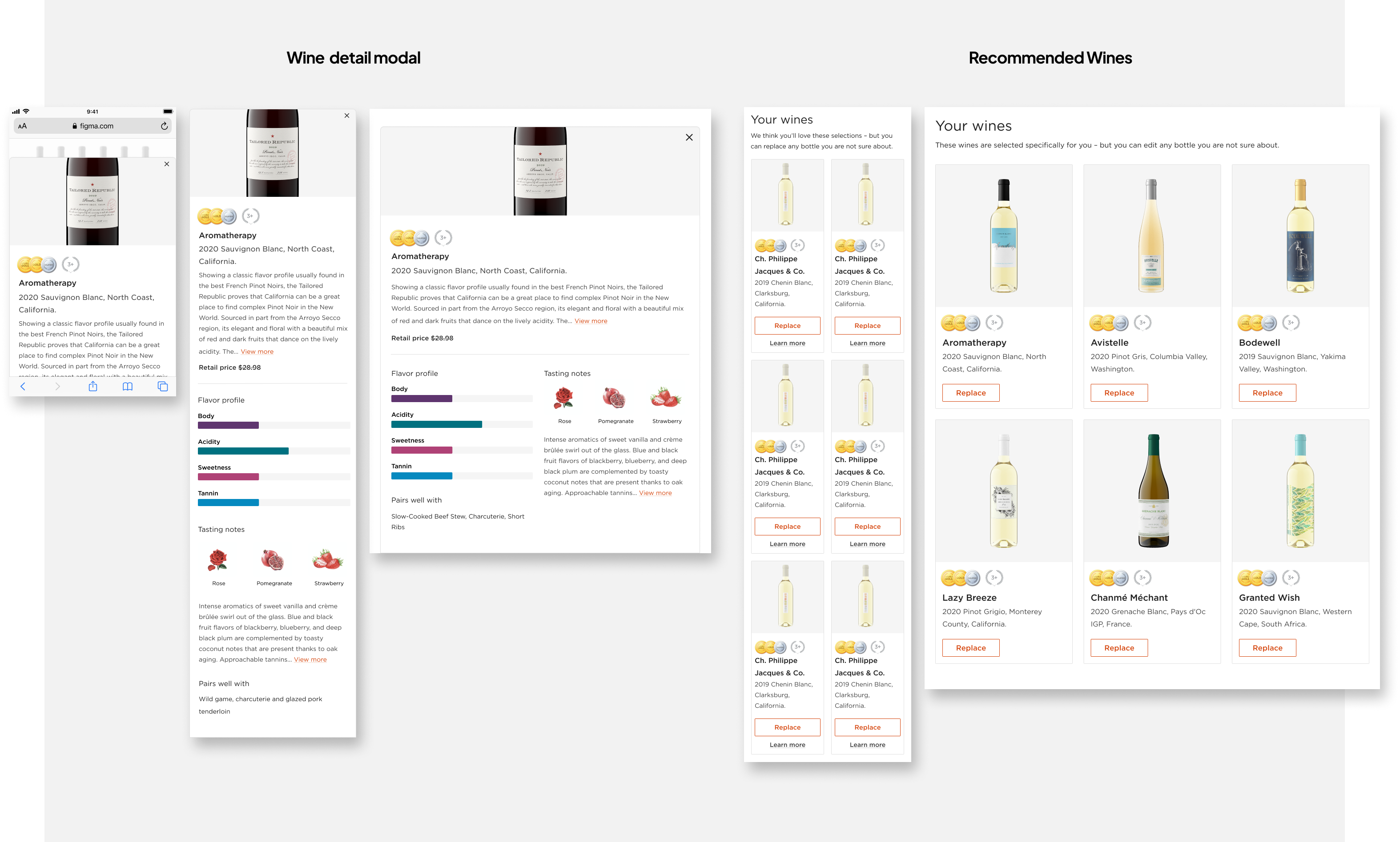
Users said they wanted more information on the wines to know if they were a good fit. I wanted to focus part of the page on giving the user the right information, at the right time, without cluttering the page. After testing and iterating we landed on a wine information modal that would provide users with more information if they wanted it.
The results page isn't a product page. In our testing users were distracted by the individual cost of the bottles. Removing it would allow users to focus on the wine quality and cost of the offer as whole
The social proof section on the original version of the page was lacking sincerity, felt pushy, and users felt it wasn't trustworthy. Using an updated approach that pulled posts directly from Firstleaf's Facebook fan page, allowed us to create a section that was authentic to our current members and spoke to the concerns of potential members.
User testers either didn't notice or were confused about what the "Satisfaction Guarantee" was and what it meant. By increasing both visibility and adding context we improved understanding through our rounds of testing.
Our target audience, represented by user testers that fit the profile, were skeptical of what strings might be attached to their club membership. Our answer to this was to provide clarity through a FAQ section that answered the questions potential members would want to know about cost, cancelation, and what to expect after joining the club.
My overall approach to the hero section was to soften the “hard sell” of the original design, focus on building trust in the results, and keep what was already working - clear pricing, user-friendly CTAs, and large bottle images.
Early explorations focused on ways to display pricing, promotions, and information hierarchy. Working with stakeholders to gain insight from their expertise and A/B testing different approaches led us to the final version.
In the final version I softened the marketing language and instead focused on personalization messaging. I increased the count down time and provided easy pathways for users to learn more about the selected wines and our satisfaction guarantee. I maintained the clear pricing, CTAs, and large bottle images.
.png)


Users in our tests didn't feel confident that the results were tied to the answers they selected in the quiz. As an answer to this, I added a personalized results section to create a direct connection between the quiz and the results page.
It was designed for the user to know we were taking their quiz answers into account.
Working closely across teams and with project stakeholders on this technically complex feature, we tested and iterated until we arrived at a simplified version that would add value to users and be easy for the engineering and data science teams to build.
The final result was two dynamically generated content sections that pulled information directly from quiz answers mixed with a section that built trust among our user testers.
In early iterations the pink text represents the copy that would be dynamically populated from the quiz answers. Each quiz answer correlated directly to a phrase, or tasting note that could populate the content of the section.


The original version of wine details section focused on pricing and had limited information about the selected wines to help users make a decision if they would like the selected wines.
The update of this section focused on creating user confidence in the selected wines by tying each wine to one of their top tasting notes, giving them more wine information, and emphasizing their ability to swap wines.
Through a process of testing, learning, and iterating, I updated the cards to improve both the mobile and desktop experience.
In the final version I removed information that our users found confusing, such as individual bottle pricing. I made the “Swap” bottle functionality more present with an updated CTA and added a wine details modal to the cards giving the user access to more wine information.
The final three sections of the page were made of components that were successful on other parts of the site. I worked with the marketing team to customize the three sections for our target user persona and potential members, providing them with the information they would need to feel comfortable joining the wine club.
I added a large bold section to emphasize our satisfaction guarantee messaging. I created a customized social proof section with positive testimonials from members of Firstleaf’s Facebook group. I also customized a FAQ section to answer common questions our test users had about the club and the commitment.
.png)
To measure the success of the project we retested the quiz flow with the updated results page using the same methods we had used in prior tests. We also ran A/B tests against the old results page.
Our qualitative testing showed improved trust in the wine results. Users focused less on brand recognition and felt the results were more tied to their quiz answers.
Our quantitive testing showed a significant bump in conversion rate.

My role on this project was Product Designer. I was involved in the project from discovery through post launch testing taking part in research and driving the creative process. I was responsible for creating user maps, wireframes, making all the user experience choices, user Interface designs, user interactions, and prototypes. I also created all of the illustrations, except for food and tasting note illustrations which I worked with a contracted illustrator to create.
Functioning as Firstleaf’s main onboarding, the quiz is an important part of Firstleaf’s acquisition and organic growth funnel. If you're joining Firstleaf’s wine club you’re, most likely, doing it through the quiz.
While the quiz does drive the company's business goals, like customer leads and member conversions, it also has a couple other purposes. First, it provides the algorithm with the initial information that it needs to give accurate wine recommendations to potential members. Secondly, it functions as a way for potential members to learn more about their tastes and helps to build trust in Firstleaf’s wine recommendations.

The goals for this project were to improve engagement in order to improve the quality of the data collected from the quiz, and to improve first-order retention without hurting conversions.
Looking at user data and member survey results, we knew that if a member liked two or more wines from their intro order they would stay in the club for at least one additional club order.
A couple of problems we were seeing were that click through rate and conversions were worse on mobile than desktop and most users were skipping a majority of the quiz questions, even if they were completing the quiz.
From this we reasoned that the mobile user experience and lack of engagement were affecting the quality of the wines being recommended, leading to a lower amount of members being retained after the intro order.
This was backed up by our user testing results.
After running user testing on the current version of the quiz we saw a few themes.
Looking at the data we collected and our core user personas, we could see that the quiz was doing a good job of driving conversions, especially among the Value Maximizers persona, whose primary driver is finding a good deal on wine. However, the quiz wasn’t building enough trust among Cautious Explorers, a user persona who was more likely to drive the engagement and retention metrics we were looking to affect.

Because the quiz answers are used to guide the algorithm’s wine recommendations any major changes could affect accuracy. The team worked closely with data science to make sure the changes we made were going to be beneficial to the algorithm and not disruptive to the results.
Because of this we were limited in what we could change. We couldn’t change the question order, the answer choices, or make any changes to copy that would affect the meaning of the question. As a general rule we also couldn’t add questions, although we did bring back one that had been removed as an option in a prior update.
Taking all of this into consideration, I chose to focus on improving the key learnings we took from user testing. I did this by focusing on improving the user experience, making user interface updates, adding micro-interactions, and updating the question's descriptive content to make it more clear without changing the meaning.
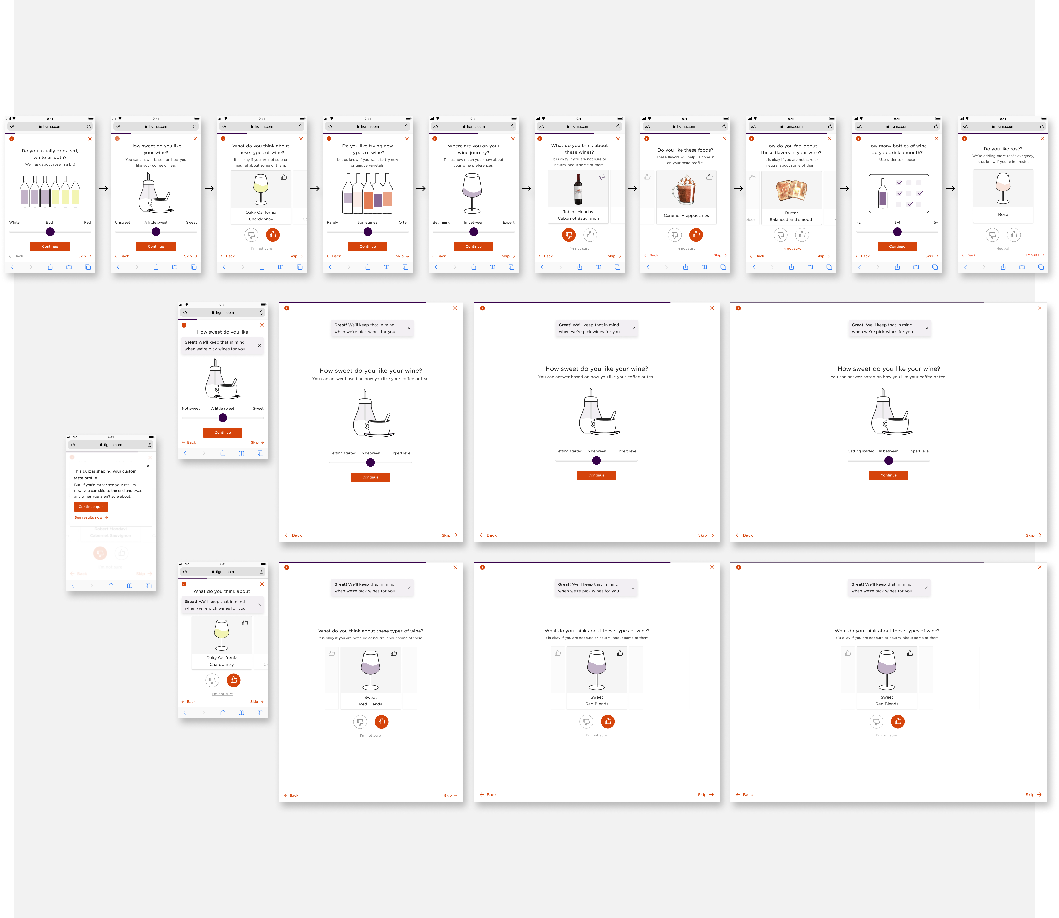
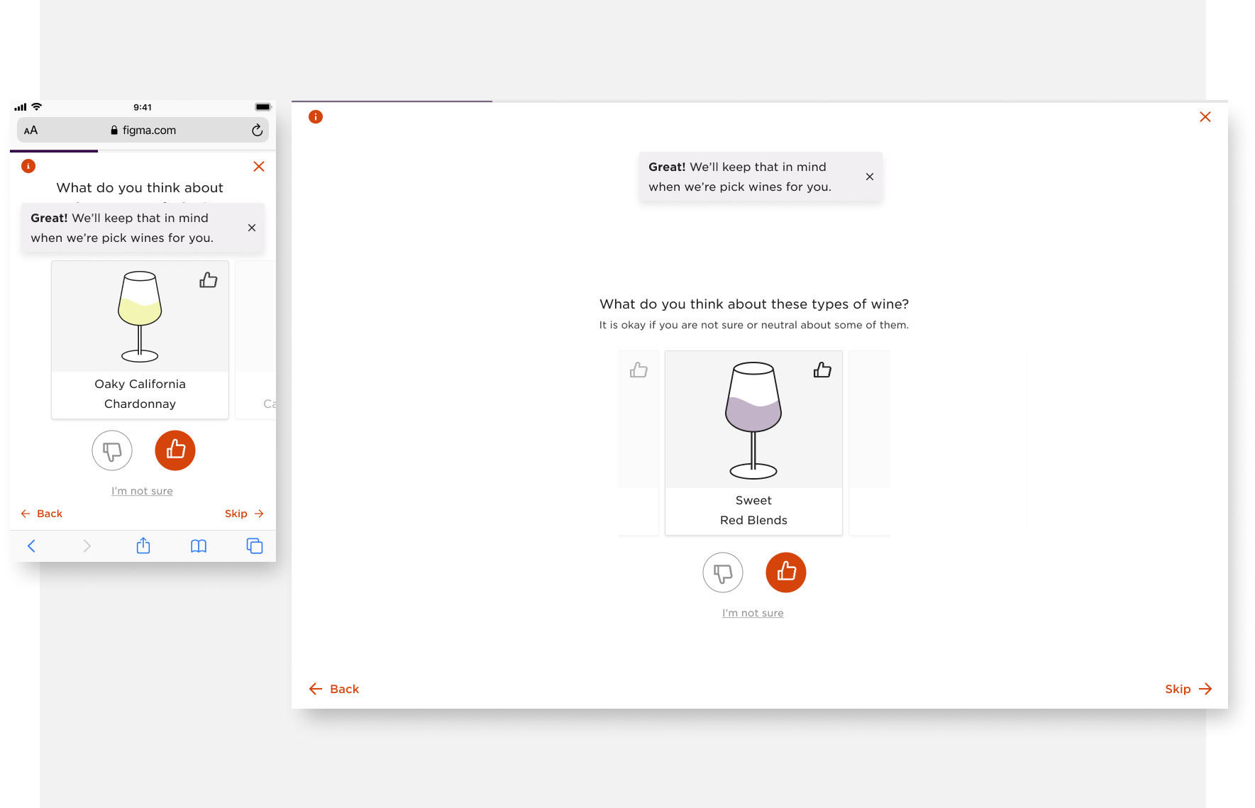
Through a process of testing and iterating, our team along with a copywriter and the data science team, worked on ways to improve question comprehension. By editing copy for clarification, adding context, imagery, and illustrations, and making our neutral option visible, we were able to increase comprehension among testers.
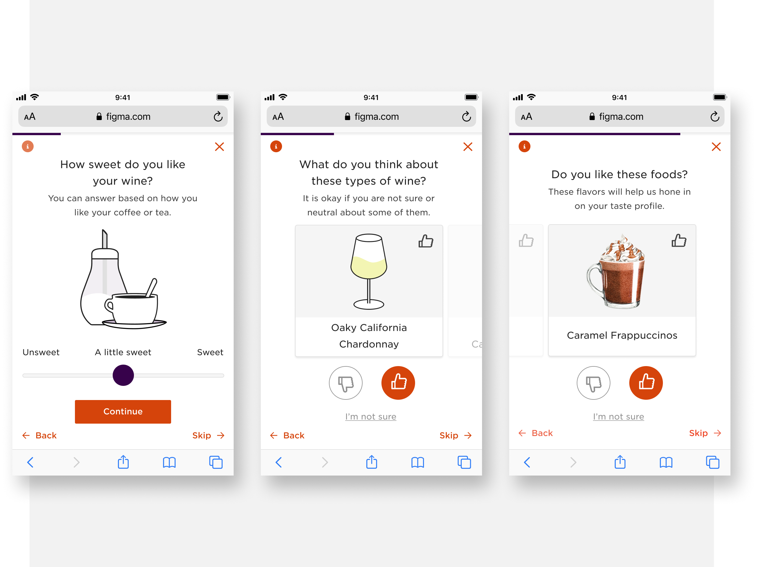
We knew from our testing that users found the multiple choice questions from the quiz overwhelming. Each of the questions had up to nine items with three possible choices for rating each item. For example, If the items were wines, The user could "Like" the wine, "Dislike" the wine, or leave the wine's choices blank to leave it as a neutral rating.
Because we couldn't reduce the number of items or the number choices per item we worked on ways to focus the user on each item individually and making the neutral option more clear.
After testing different ways to display items and choices we settled on a slider that would automatically move the user to the next item when they picked one of the available options.
Focus the users attention on one item at a time also allowed us the space to eliminate scrolling even at the smallest mobile screen sizes. With the extra space we were also able to make the skip option less visible and provide more context and feedback to the user.
Data analytics and user testing had both shown that users didn't feel that completing the quiz without skipping questions was valuable to them. With this in mind we worked on ways to encourage users to continue to engage with each question on the quiz. We minimized the progress bar and focused on user feedback and micro-interactions to show them their answers were being taken into consideration.
For multiple choice questions, we added an interaction to the card to show that their choice had been saved. We also added encouraging notifications for different use cases and items we knew were polarizing. For slider questions, we updated illustrations to show the slider was changing data as they moved it in different directions.


All of the updates that were made to the quiz experience were designed with a mobile first approach. The analytics showed that the majority of Firstleaf's users were visiting the site using mobile devices.
Combined with the user experience updates, UI changes such as removing the sticky footer, reducing font and image sizes, and making edits to copy length, we were able save space and eliminate scrolling on mobile devices.
All of this worked to improve the click-through rate and engagement for the quiz by a significant margin.
In pre-launch user testing we found that users enjoyed the overall experience more than the original. With some users calling the experience light and fun.
Post-launch testing showed significant improvements in the metrics we were trying to affect with the updates, especially on mobile devices. We were able to improve click-through rates, user engagement, and showed a small uptick in conversions.
We also found that by moving the "skip option" too far away from where users interacted with the questions we hurt conversion rates on larger screen sizes. We corrected this with a quick update to the large screen sizes which improved the affected numbers.
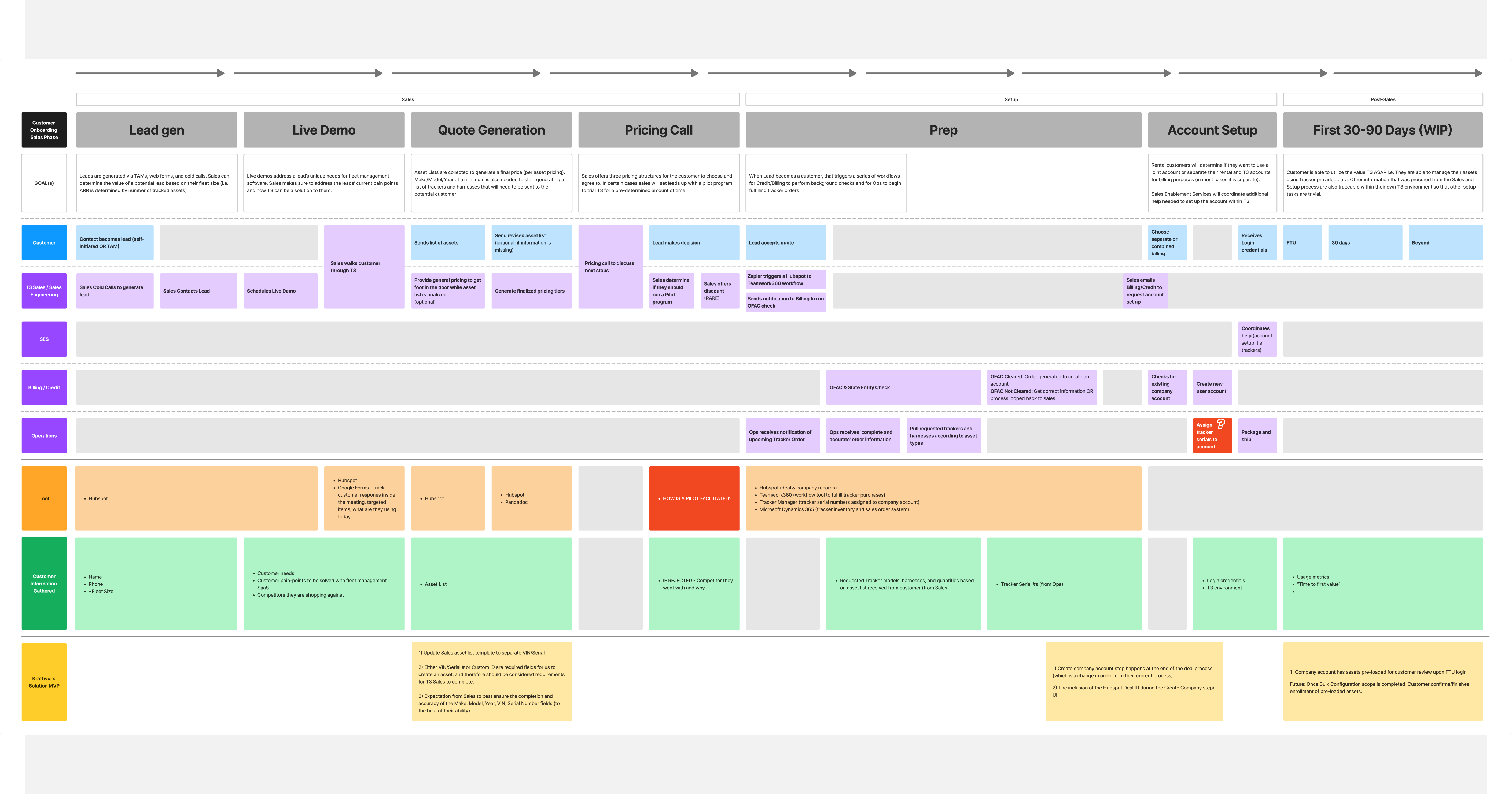
My role on this project was Product Designer. I collaborated with a Product Manager and Engineering Manager to co-lead a cross-functional team from discovery through launch⎻to research and define the problem, ideate and design the user experience, get stakeholder buy in, and ultimately deliver a solution that would meet company and user needs.
EquipmentShare’s rental and SaaS business is heavily dependent on hardware devices, such as trackers and cameras, that connect to equipment to track everything from location to driver activity. These devices enable EquipmentShare and customers of their T3 platform to efficiently manage and maintain their fleet of construction equipment and vehicles, referred to as assets. As both sides of the business continue to grow, so does the urgency to improve the speed and ease of tracker installation.
Our team took on device installation after other attempts within the company had stalled. We were tasked with creating a solution that could be built within a reasonable amount of time.
.png)
Starting with what we had already learned about the new customer and fleet onboarding process, we immersed ourselves in the device installation process by interviewing internal and external experts in the space. Speaking with device installers, customers, telematics experts, and customer support.
We did a thorough review of the company's self-install documentation and documented the internal ‘white-glove’ installation process. We did comparative research of competitors and companies in similar spaces, and toured the warehouse where devices are received, processed, and shipped to customers, documenting and interviewing the leaders of those teams.
These findings led us to a few reoccurring themes that helped us narrow in on a solution that could be delivered quickly.
.png)
We focused on three reoccurring themes; tracker Installation, new device status vs ongoing health status, and T3's lack of a device user experience.
As we started to understand the broader space we also began to narrow the scope.
Tracker installation is inherently challenging due to asset design variability; not the user knowledge required to install a tracker.
Three of the four device types, non-utilization location trackers , light-duty vehicle trackers, and cameras are fairly straight forward to install. They benefit from simpler assets and industry standards that make installation a repeatable and relatively simple process.
The fourth type, utilization trackers for heavy-duty vehicles and equipment, lack those industry standards. This causes obstacles such as difficulty placing various devices with customized harnesses. This type of tracker made up 46% of the company's device sales.
Existing install guides are a sufficient customer solution to support device installs for non-utilization trackers, vehicles, and cameras.
Our recommendation was to ensure these are proactively provided to users in a convenient location.
Giving access to our internal installation guides for heavy-duty equipment devices wasn’t recommended because it would require significant resources to develop a comprehensive set of guides and could expose internal trade secrets to our customers.
First-time device status vs ongoing device health updates were a different troubleshooting problem.
First-time issues are often the result of not adhering to installation guidelines or rare faulty devices. Troubleshooting these are fairly simple and can be easily identified.
Issues with tracker health beyond initial installation are vast with many causes and different troubleshooting steps. More information about the asset and asset activity are commonly needed. Further complicating troubleshooting a devices health by customers and EquipmentShare installers was a fragmented experience across multiple device-specific internal and external tools.
First-time tracker status.
Focusing our efforts on the more managable first-time tracker status would let us get to a solution quicker, allowing us to provide benefit to our customers and learn from how they interact with the experience.
On-going Tracker health.
It’s was more efficient and user friendly for this type of troubleshooting to be completed by Customer Support, rather than customers trying to self-serve and becoming frustrated.
There wasn’t an experience that provided device information separate from the vehicle or piece of equipment it was connected to. This lack of engagement with trackers and cameras, independent of those assets, minimized users' ability to install, manage, and assign devices.
Creating a simple way for customers to see their devices and know if they have completed all the steps necessary to track them in T3.
After collecting tracker installation insights, our team decided to pursue T3’s first ever device inventory experience. The MVP product would provide customers with a catalog of the company’s trackers and cameras independent of any asset association(s), and would display the status of their tracker installation and tracker utilization.
The new feature would support new customers as they onboard their fleet and devices, and would benefit existing customers as they purchase new devices.
Upon receiving a sales order, the fulfillment warehouse prepares devices for shipment. Device serial numbers are assigned to the customer's company_id, populating their account for asset assignment.
Once the devices are received by the customer, there are three required onboarding steps to begin utilizing them on the platform. The steps can happen in any sequence.
Once these steps are successfully completed, the customer can begin managing their fleet on the platform. This was easier said than done. We found that often customers didn’t retain the full utilization of their devices because one or more of the above onboarding steps wasn’t completed. The causes for this incompletion varied, but the primary causes we heard were:
Because of this our design approach focused on visibility, clarity, and action. The biggest opportunity we saw was to provide visibility on what devices they had, clarity of the steps they needed to complete, and the ability to view their progress and take action to complete the process.

We knew from our interviews that users lacked clarity of the steps to onboard a device onto the platform and could use more visibility and easier access to the information they needed. So we built our user stories and experience around providing as much visibility into devices as we could pack in.
The design gave them a direct view into how many devices they had, which devices needed attention, what steps needed to be accomplished for a device to be considered complete, and a progress bar to help them track their device onboarding progress.
They also had the ability to filter to specific device types and statuses and could dive deeper into individual device information and download installation guides.
To make things clearer, we provided help text and tool tips to define terminolgy and add clarity.


The ability for customers to take action on this new tool was a crucial element in the experience. The final experience we delivered allowed customers to easily take the needed steps to complete the device installation and onboarding process.
Using the 'Device Install Overview' widget as a hub that linked to an actionable device list allowed us to filter users directly to the action they were looking to take. They could easily focus on either installation or assignment. The filters also let them search and filter by device type and serial number.
Once there, they could link into flows that would let them find more information on their device, quickly assign their devices, or get help with install issues.
.png)
.png)
.png)
Our first release was limited to new customers. While both customer responses and metrics showed positive signs in both usage and time to first value, our learnings were limited by the number of customers that onboarded during our test period. We wanted to increase our learnings and introduce the experience to more customers.
After a small update that would allow existing customers to clean up dirty data (returned devices that were still showing on their account), we launched to existing customers. Learnings are still ongoing, but the responses from customers were overwhelmingly positive.
This will be great for us in terms of utilization. Being able to see which devices we have, but are not using, because it's not installed or reporting a location.
Thank you for making this so intuitive and straightforward!
Rapid growth led to unsustainable scaling challenges within the platform's onboarding process. Specifically, the necessity of providing intensive 'white-glove' onboarding services for larger companies.
Through discovery work, we determined that maximizing customer value and scalability required creating a self-service fleet onboarding experience.
.png)
Analysis and customer usage and interviews with customers revealed a few issues:
As the Sr. Product Designer, I collaborated with a Product Manager and Engineering Manager to co-lead a cross-functional team from discovery through launch. Among other things my responsibilities included:
Being unable to get a clear picture of EquipmentShare’s current company onboarding process we set up internal conversations with the teams involved in the process and charted out the full experience from Lead generation to first login.
This helped us identify several opportunities to improve the onboarding experience.
Weighing our opportunities against level of effort and our key metric, time to first value, helped us narrow our scope and focus on a couple of high impact areas of the experience that we could achieve quickly then learn and iterate on.
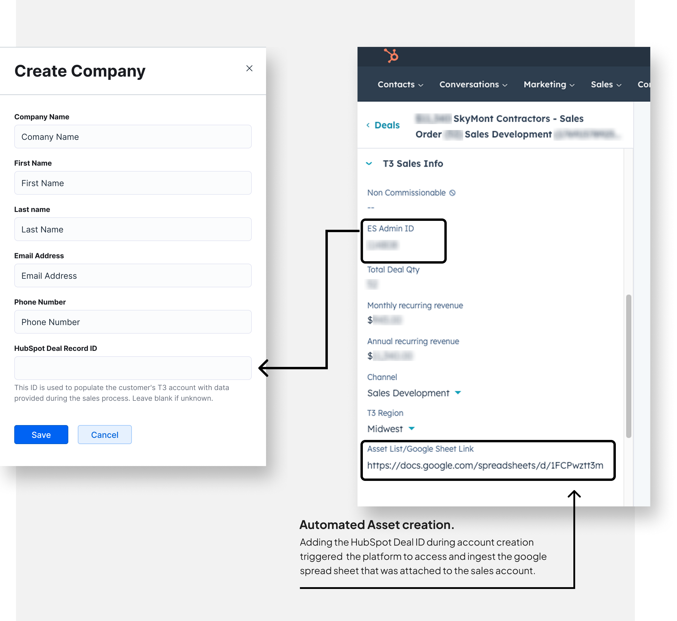
During discovery we learned that the sales team was collecting customer asset data, using a google sheet, and attaching it to Hubspot, where they were tracking progress during the sales process.
With a small change to their process, and a hub spot integration, our team was able to ingest the necessary asset details and use them to automate the creation of a customer’s assets in the platform. This allowed new customers to have assets available the first time they logged in. This eliminated a huge obstacle to new customers faced while onboarding and had a huge affect on time to first value.
When customers logged on to the platform for the first time they weren’t confident in where to they could start getting value out of the platform. This caused them to be relignt on customer service help.
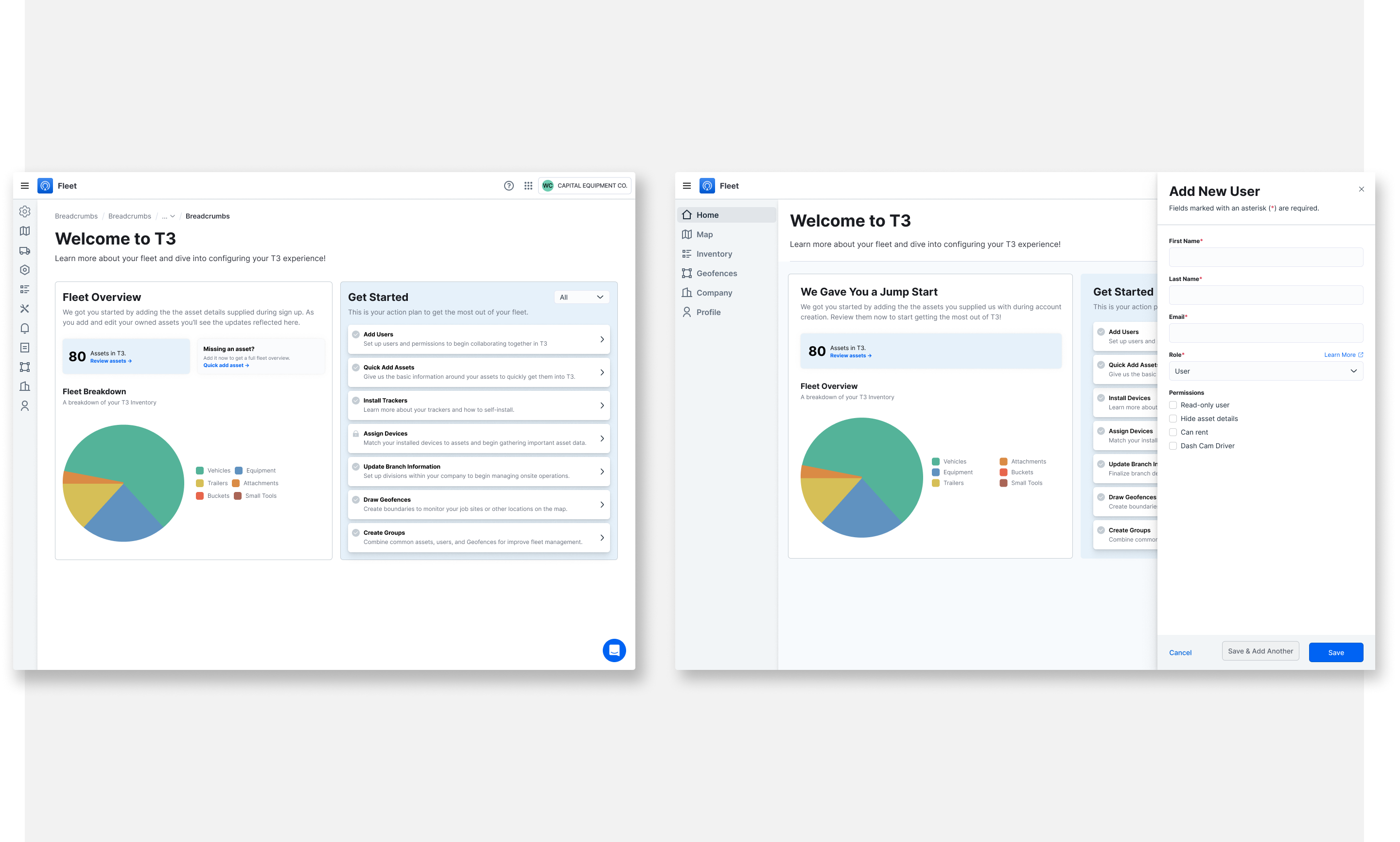
Our solution to this started by simplifying information architechture by added a dedicated page to guide new customers through onboarding their fleet, users, and company. We called it the Set Up page.
The Set Up page consisted of guided actions and optimized workflows of the most valuable actions new companies needed to take to begin receiving value from the platform. These workflows were intended to support a quick fleet configuration and customer onboarding, accelerating customers time to first value.
.png)
Time to first value (TTFV) was a priority metric for our team that represents the amount of time it takes for a customer to receive tangible value from the product. For our purposes, we aligned on this metric being calculated as the duration between first company login event and first asset with tied and reporting tracker.
In the first few months of release we saw a 25% improvement on Time to first value. being tied to trackers among customers with access to the new experience, vs those without during the same time period.
This lead to releasing the experience to all customers both new and existing, decreasing the burden on customer service and giving customers a tool to help themselves.


